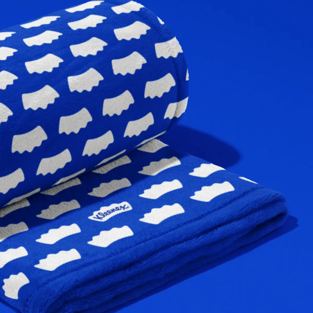
Kleenex recently celebrated its 100th anniversary with a rebrand by Turner Duckworth, modernizing the brand while keeping its iconic identity intact. The new logo features a crown shape housing the wordmark “Kleenex,” emphasizing the brand’s leadership in the tissue space. The rebrand also unifies Kleenex’s global presence by introducing a consistent navy blue color and a bespoke typeface, “Kleenex Serif.” This fresh identity feels timeless, yet familiar, aligning with the brand’s heritage while looking toward the future.


Images credit: Kleenex

