Website navigation is the backbone of your online presence. It’s the roadmap that guides visitors through your website, helping them find the information they need quickly and easily. Poor navigation can lead to frustration, confusion, and ultimately, visitors abandoning your site. So, how do you create website navigation that provides a seamless user experience? Let’s explore the best practices.
1. Plan Your Navigation Structure:
Before you start designing your navigation, take the time to plan your website’s structure. Organize your content into logical categories and subcategories. A clear and well-organized structure makes it easier for visitors to find what they’re looking for. Think of it like creating a sitemap – it’s the blueprint for your navigation.
2. Keep it Simple and Intuitive:
Avoid complex or confusing navigation menus. Use clear and concise labels that are easy to understand. Don’t try to cram too many options into your main navigation menu. A simple and intuitive navigation experience is key to user satisfaction. Think about how easy it is to navigate Amazon’s website – clear categories, intuitive search, and a streamlined checkout process.
3. Use Familiar Conventions:
Stick to familiar navigation patterns that users are accustomed to. For example, most websites place the main navigation menu at the top of the page. Using familiar conventions makes it easier for visitors to navigate your site without having to learn a new system. Users expect to find a “Contact Us” or “About Us” link in the footer, for example.
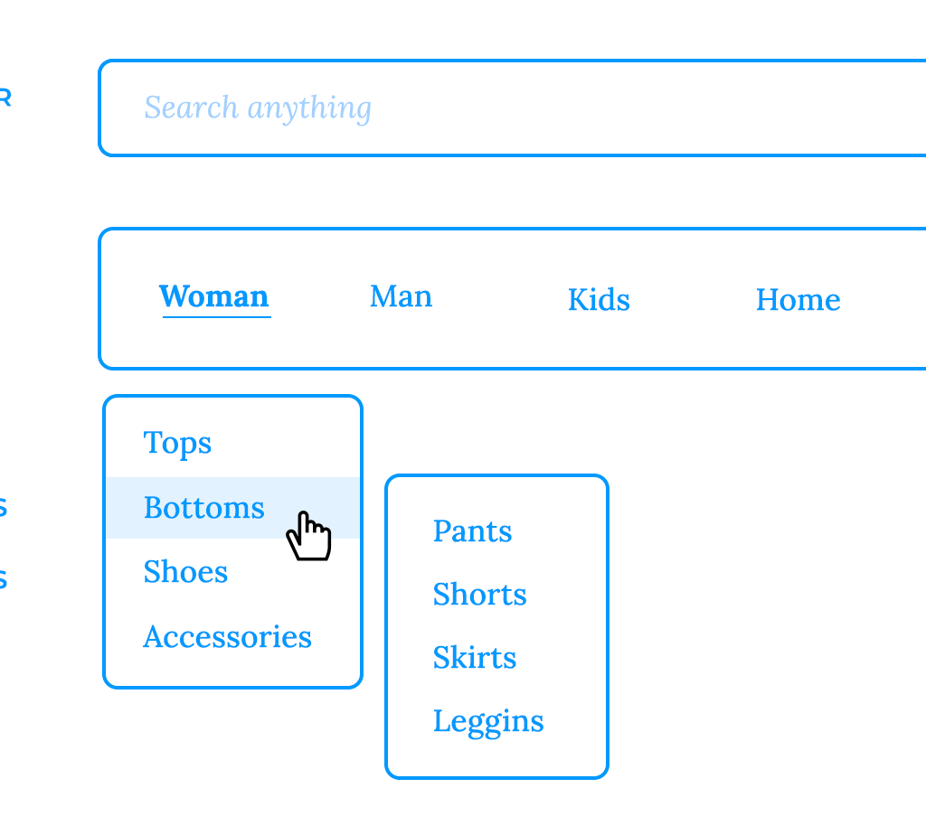
4. Implement a Clear Hierarchy:
Use a hierarchical structure to organize your content. This means using parent categories and subcategories to create a logical flow. A clear hierarchy makes it easier for users to understand the relationship between different pages on your website. Think of a library’s catalog system – books are organized by genre, then sub-genres, making it easy to find a specific book.
5. Provide Search Functionality:
A search bar is an essential component of website navigation, especially for websites with a large amount of content. A search bar allows users to quickly find specific information without having to browse through the entire website. Make sure your search bar is prominently displayed and easy to use. Consider advanced search features like filtering and sorting for complex websites.
6. Use Visual Cues:
Visual cues, such as icons, color coding, and clear typography, can help to guide users through your website. Use visual cues to highlight important links and make your navigation more visually appealing. For example, using different colors for active links or highlighting the current page in the navigation menu.
7. Mobile-First Navigation:
In today’s mobile-first world, it’s crucial to design your website navigation with mobile devices in mind. Use responsive design techniques to ensure that your navigation is easy to use on any device, whether it’s a desktop, tablet, or smartphone. A hamburger menu is a common mobile navigation pattern.
8. Test and Iterate:
The best way to know if your website navigation is effective is to test it with real users. Use usability testing tools or simply ask friends and colleagues to navigate your website and provide feedback. Based on the feedback you receive, make adjustments to your navigation to improve the user experience. Heatmaps and analytics can also provide valuable insights into user behavior and help you identify areas for improvement.
9. Breadcrumbs:
Breadcrumbs are a secondary navigation element that shows users their current location on the website. They are particularly useful for websites with a complex hierarchy. Breadcrumbs help users understand how they got to where they are and make it easy for them to navigate back to previous pages.
10. Footer Navigation:
Don’t forget the footer! The website footer is a great place to include secondary navigation links, such as contact information, about us, privacy policy, and terms of service. It’s also a good place to include social media links.
Example Case Study:
An e-commerce website redesigned their navigation, simplifying the menu structure, adding a prominent search bar, and improving the mobile responsiveness. As a result, they saw a significant decrease in bounce rate and an increase in conversion rates.
What Makes This Worthwhile:
Seamless website navigation is essential for a positive user experience. It helps visitors find the information they need quickly and easily, encourages them to explore your website, and ultimately drives conversions. Investing in good website navigation is an investment in your online success.